Visualizing IP Connections in Python
For some research on botnet host detection in large-scale networks, I found myself in the situation that I had to apply a set of algorithms to a huge packet dump. To comprehend an amazing paper, I started to play around with the dataset and tried to reproduce the results presented in the whitepaper. Quickly I realized that there was something fishy with my own dataset, so I fired up jupyter-notebook to gain some more insight in the IP structure of my dataset.
My standard tool when dealing with packet analysis in Python is scapy. For visualization the quasi-standard is matplotlib. When dealing with graphs, I found NetworkX to be very reliable and performant on bigger datasets. So let's get started. First the usual dance:
import networkx as nx
import matplotlib.pyplot as plt
from scapy.all import *
%matplotlib inline
When fiddling around, I noticed that a large-scale directed graph tends to get confusing very quickly as the arrowheads on long edges get distorted. An undirected graph is just as fine for me, because I just want to get a general impression of the datasets IP connection structure.
G = nx.Graph()
connections = set()
nodes = set()
Don't forget to use sets to automatically filter out duplicate IP addresses. Now we will go through the dump packet by packet, extract the IP header data and add the relevant data to our sets. connections holds tuples containing source and destination, while nodes is a set of all existing IP addresses contained in the set.
with PcapReader('/datasets/pcaps/internal-clean.pcap') as pcap_reader:
    for p in pcap_reader:
        if IP in p:
            nodes.add(p[IP].src)
            nodes.add(p[IP].dst)
            connections.add((p[IP].src, p[IP].dst))
Notice that I don't use rdpcap as this would try to load the whole pcap into RAM. Even with my dataset of roughly 550MB, the scapy datastructures took in more of 3GB RAM and filled my swap of 4GB completely. Analyzing the data with my machine took approximately five minutes. I am aware that it would have been more efficient to throw away the payloads of the pcap or even convert it into NetFlow format. However that would have been out of the scope of this quick and dirty hack. :)
Now let's add the data to our graph and prepare the figure size of matplotlib. The graph will get pretty big and the above figsize results in an image with 7250×5793 pixels. As there is a lot of data to look at, it's always good to be able to zoom in and have a closer look at some hosts.
G.add_nodes_from(nodes)
G.add_edges_from(connections)
plt.rcParams['figure.figsize'] = 150, 120
Now all we need to do is apply a layout to the graph and draw it using the NetworkX method that uses matplotlib by default. I found the Fruchterman-Reingold force-directed algorithm at >50 iterations to be the most visually pleasing and ordered. If you want to try your luck, a random layout might also yield good results.
pos = nx.spring_layout(G, scale=1.0, iterations=100)
nx.draw(G, pos, node_color='c',edge_color='k', with_labels=True)
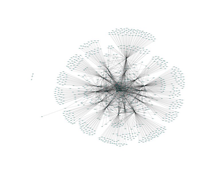
The above code results in the following image (here scaled to 1920px):
You can also find the full-size image (7250×5793px) here.
